Strategy Development
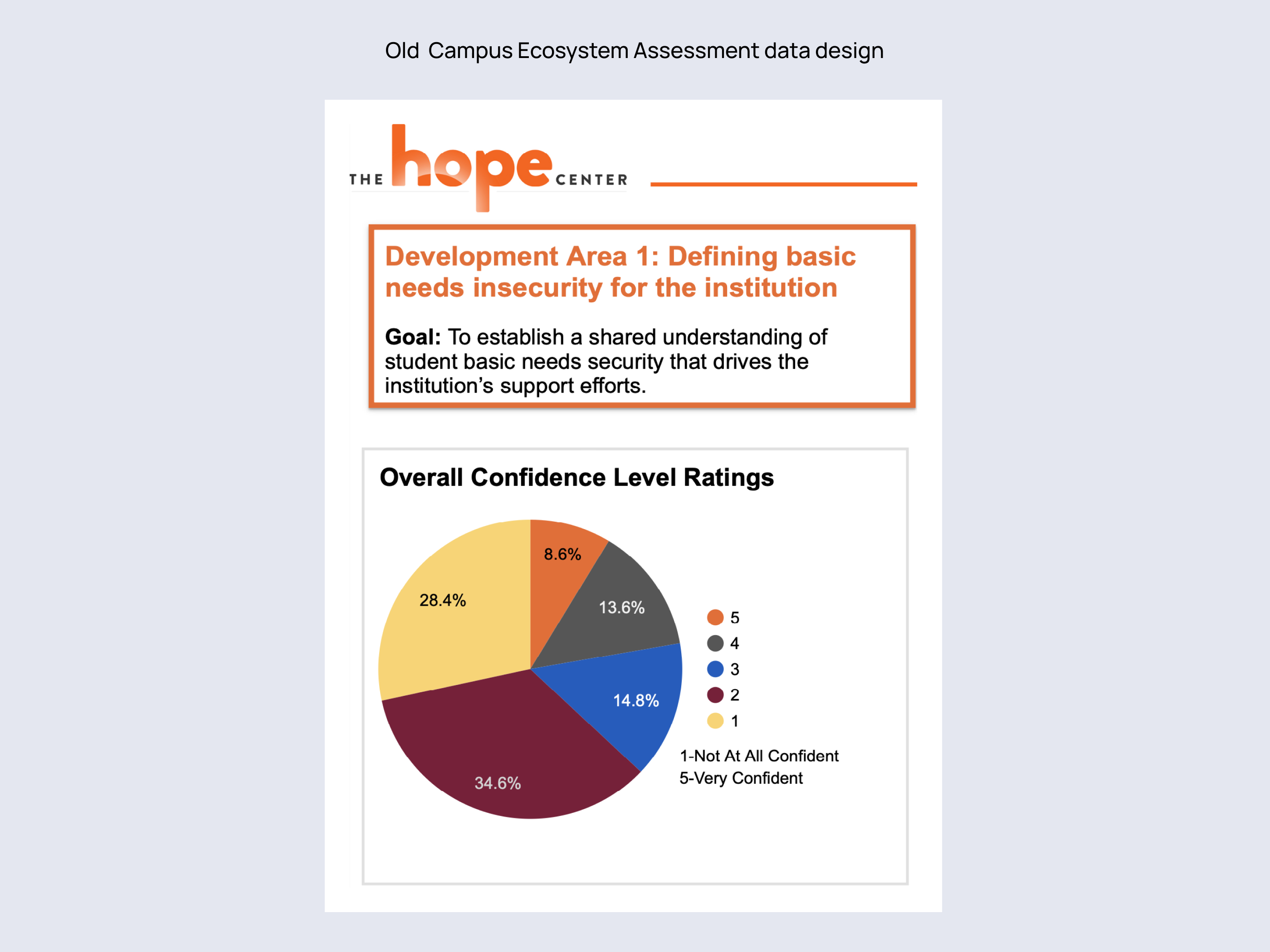
I wanted to build something that was easily scalable and customizable for each institution, without requiring a staff member to write anything in order to complete the report. In auditing the existing reports, I spotted several sections of written content that were redundant with what was being delivered graphically, which helped lay the groundwork for a more condensed content strategy.
Beyond the reports themselves, my marketing experience drove me to advocate for an architectural structure that would take advantage of existing relevant research the Center had published to help institutions formulate a plan after consuming their reports.
Architecture
As a subscription product, the dictating factor for what a user sees is based on which reports their institution has purchased.
To standardize the experience, and to avoid prioritizing one report over the other, I included:
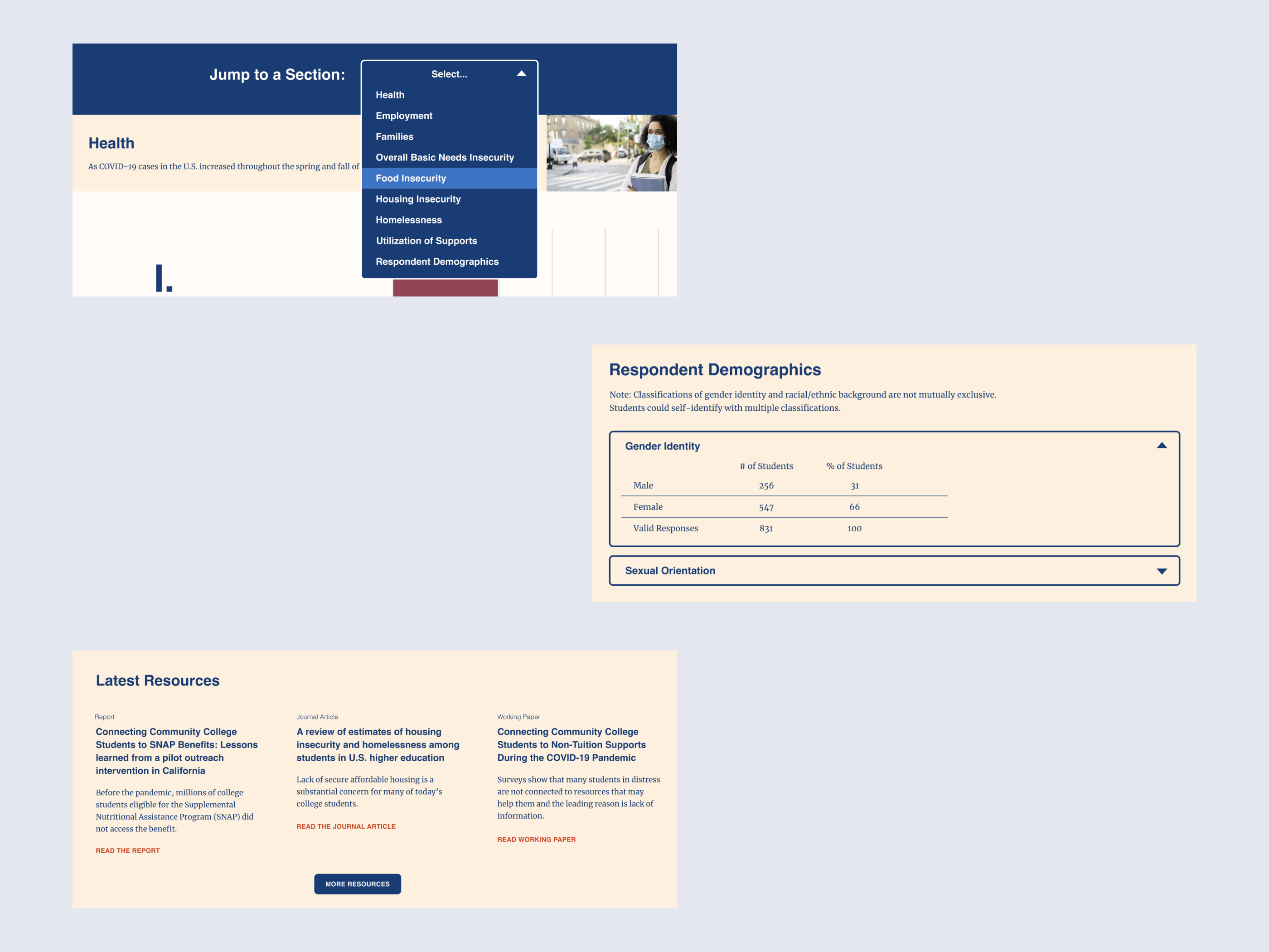
• A dynamic homepage that allows for a contextual introduction to each report, as well as a way to highlight the latest news
• A main page for each report. For usability (and shareability) on the #RealCollege survey, separate subpages for each topical section
• A resources section that pipes in articles from the main Hope Center website, delivering timely answers to the “now what?” question that inevitably arises from school administrators
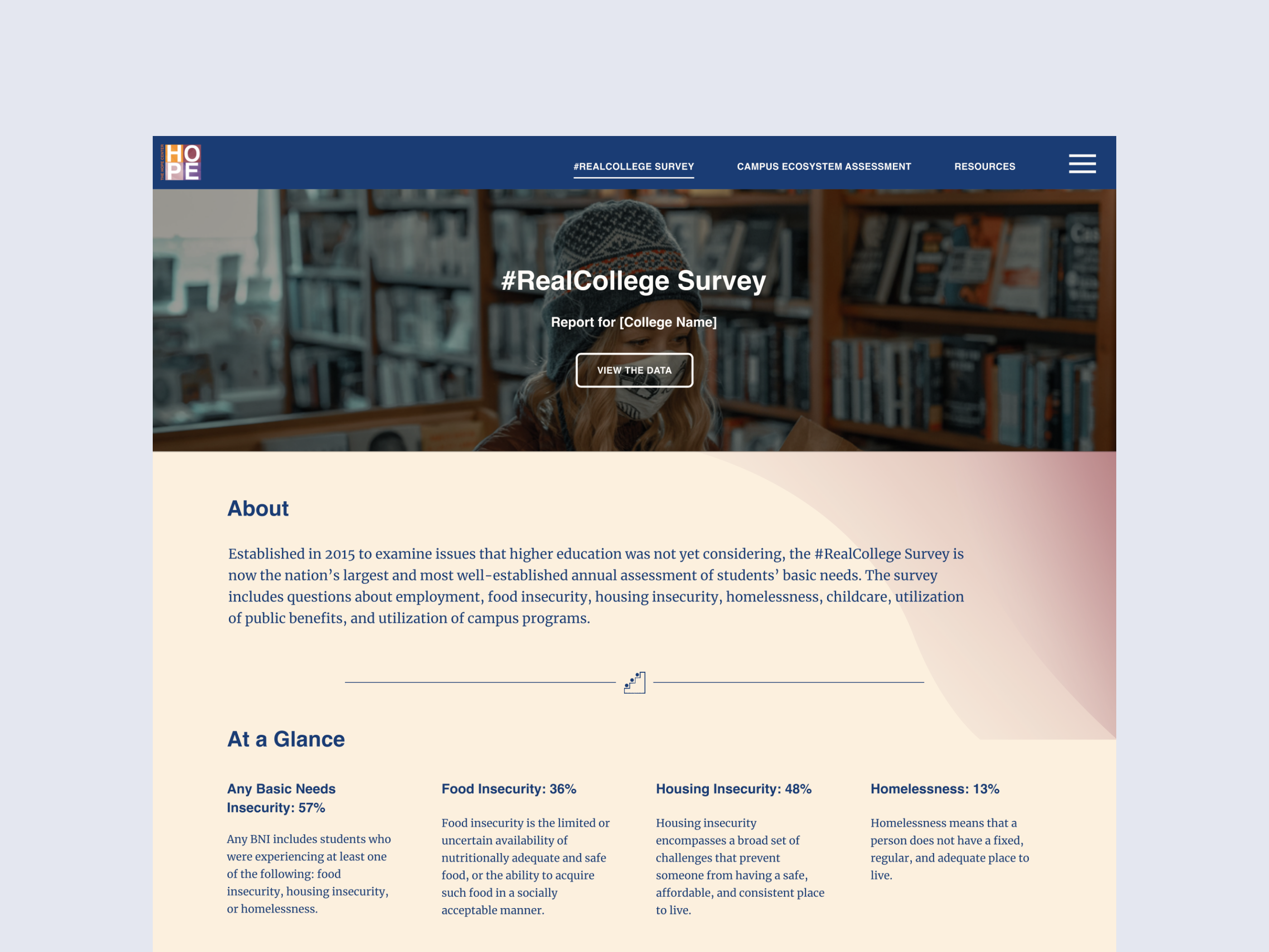
• An About section to explain the initiative and to talk about The Hope Center's evolving research
Product Design
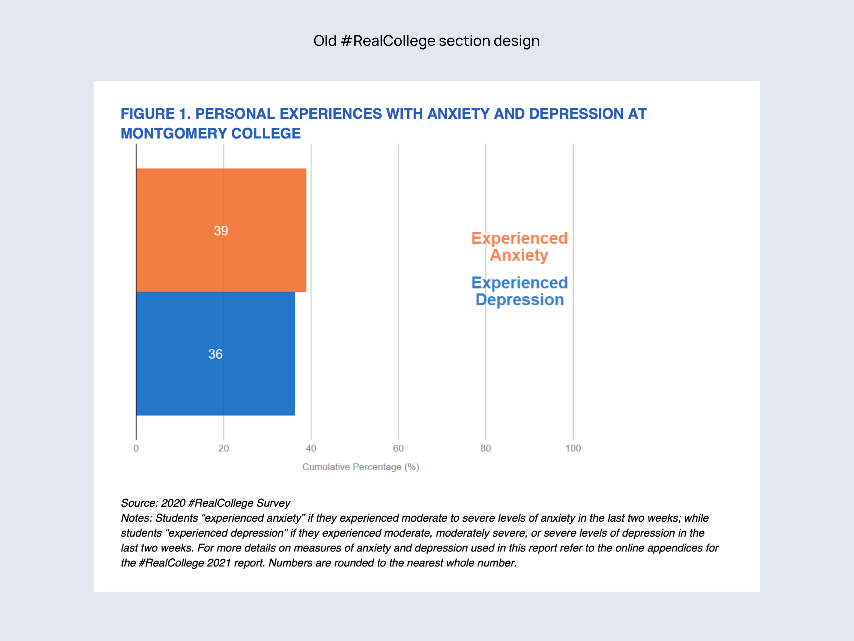
While there were existing print reports and a new set of brand guidelines, neither proved ready for the task at hand. The color palette wasn’t WCAG/508 compliant, and the use of colors was inconsistent and confusing. Additionally, there was only one approved font, and it only had two weights.
To expand our design options, I started with a small branding effort to find accessible (and aesthetically pleasing) colors that were connected to the brand palette, and a secondary font that would have a sufficient number of weights.
Once colors and font styles were established in a lightweight design system, I worked on how to best organize and display each section of the reports.
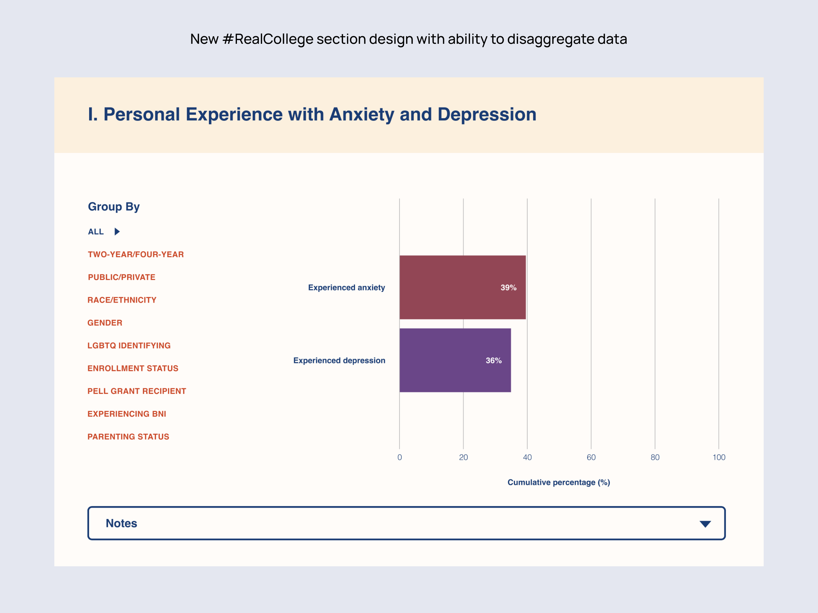
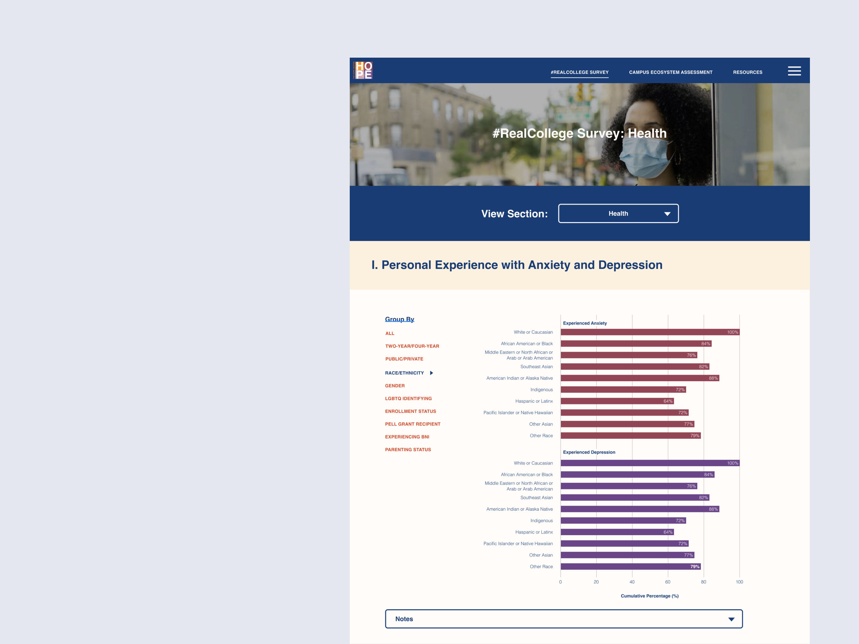
For the #RealCollege Survey, I grouped relevant sections together to make it easier to parse the report as a whole. This meant simple, static graphs with easy access to deeper versions if users want it. The Campus Ecosystem Assessment has fully separate sections, so I designed an interface where they’re all within easy reach, but only one is shown at a time to allow full focus.
Finally, I worked with the researchers at The Hope Center and their engineers to flesh out what data manipulation opportunities would be created by moving away from a PDF report. We established that the live disaggregation of data would be a major improvement for users. So the interface we developed allows for a broken-out view to show indigenous students who reported being sick with COVID, for example.