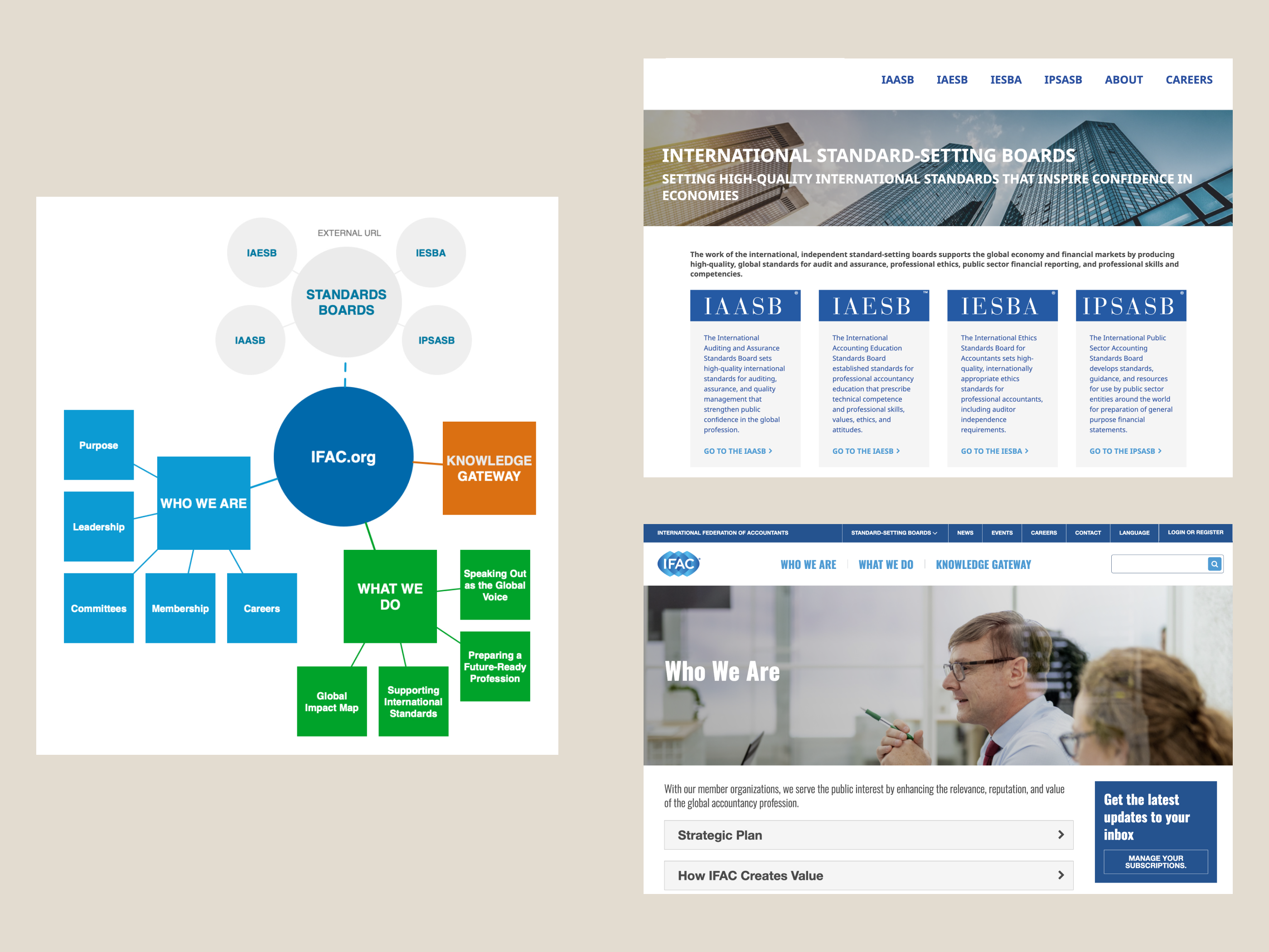
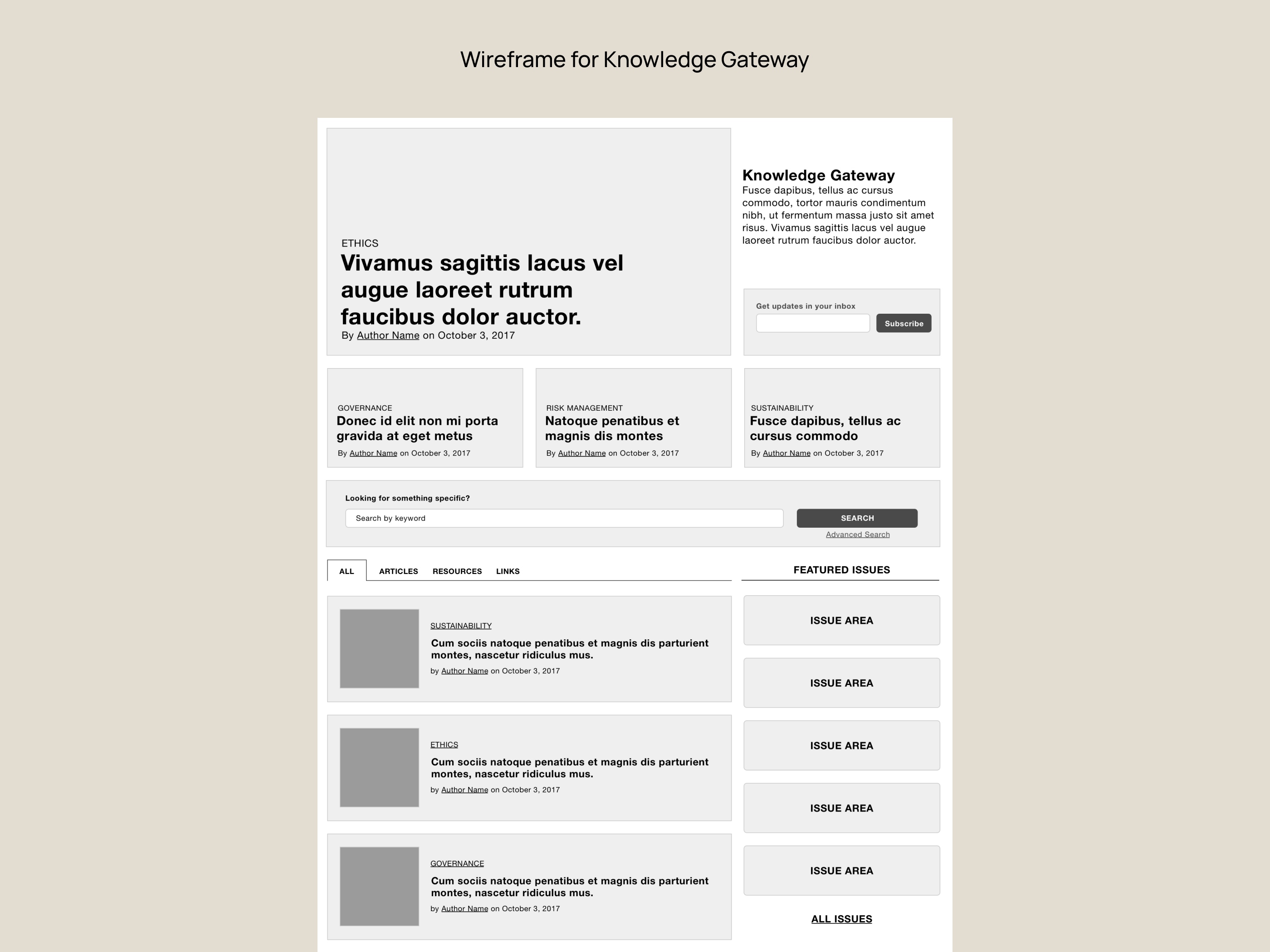
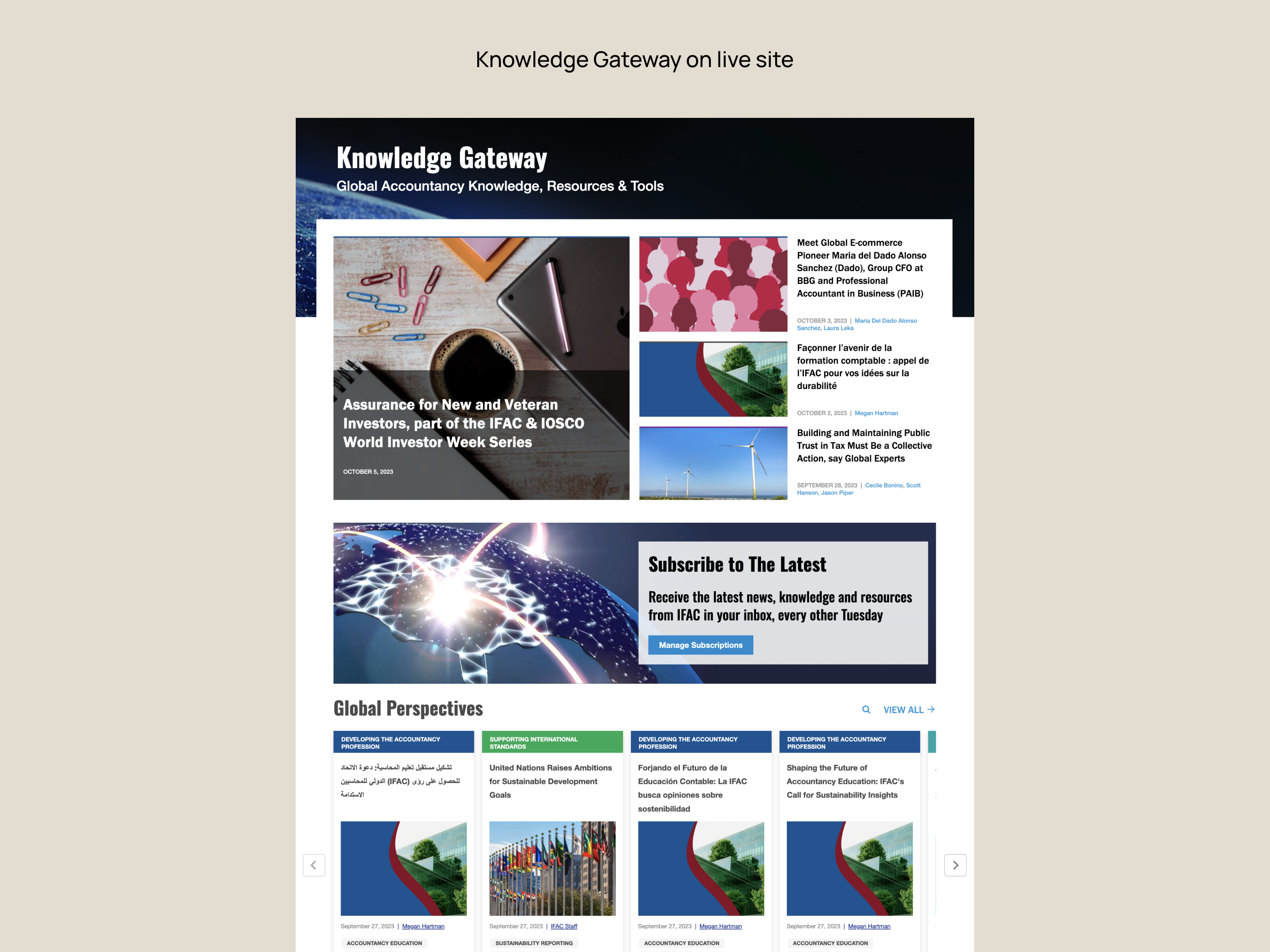
IFAC
The International Federation of Accountants wanted to refocus their website around their industry-leading insights, helping practitioners worldwide to stay current on best practices for complying with international accounting standards.

The International Federation of Accountants wanted to refocus their website around their industry-leading insights, helping practitioners worldwide to stay current on best practices for complying with international accounting standards.

IFAC is a non-profit membership organization that sets standards for the global accounting profession.
While international accounting standards are an essential pillar underpinning the quality and legitimacy of our global financial architecture, they aren't required by international law. As such, the usefulness of the materials and their transparency are particularly crucial in ensuring worldwide adoption.
IFAC's 3 million members worldwide rely on the IFAC website for key updates on standards, emerging trends in the field, and resources to help them do their jobs effectively. With over 6,700 pages of content on the old website, finding the right information was often a challenge for users.
On IFAC's old site, virtually everything was crammed into the About IFAC section. This didn't reflect their depth of resources as a publisher, and made for an unintuitive experience. They also had a new compliance issue where they needed to separate their standard-setting boards from the main organization's site.
Our agency team was brought in for a full redesign. The top priority was to create a more easily-navigable experience, highlighting the articles most likely to be useful to users, rather than an overflow of information about the structure of IFAC itself. There was also a desire to inspire more return visits, particularly to the Knowledge Gateway, and for members to find helpful articles with fewer clicks.
After all, having accountants easily access this helpful information is in the global public interest for maintaining financial stability, particularly in developing economies.
As a UX Design Lead, I was the:
• Architecture and experience lead across the project
• Chief content strategist
• Designer and builder of many (many) site pages in the Drupal CMS


To establish a strategic direction for the site, I interviewed 13 members of IFAC’s leadership team, plus the leaders of their committees and boards. I spent an entire week in IFAC's offices conducting interviews in person and a few international ones via video.
After taking copious notes, I merged them into one document and grouped them around several core themes: target audiences, goals, content strategy, design strategy and messaging.
What I heard consistently was that leadership and members wanted a shift from a product that felt institutional to one that felt dynamic, diverse and personal. One where it was easy to find and share content. And one where the societal impact of the accounting profession was clear, particularly for emerging economies.
To my dismay, our initial budget was too small for user interviews. However, in the two years after launch, I was able to lead a series of Hotjar surveys on the site, the feedback from which informed both iterative content and design changes.
I cross-referenced what I heard in the interviews by performing a series of deep dives on IFAC’s Google Analytics accounts to ensure we understood any key priorities/disruptions in the user flow.
One thing that became clear was the importance of the accounting standards themselves for users; this analytics insight allowed me to approach the architecture for the board sites in a much more effective way.
After analyzing the interview transcripts for themes and comparing them with GA data, the following strategic needs became clear:
• Pivot the site from talking about IFAC to focusing on the information that’s valuable to their members
• Deliver publications in places users expect to find them
• Build better content relationships so things feel less siloed
• Improve the findability and the dynamic nature of information
• Make the site easier to update for IFAC’s comms team, building a design system and relying less on unique page templates
In addressing these priorities, the site began to take shape around three core sections:
• One to contain all the resources (unlike the old site), allowing us to heavily optimize the search and filtering experience there;
• A second to tell the story of IFAC’s impact in clear and compelling ways, rather than providing endless PDFs about who they are;
• And a third to provide relevant membership information and organizational background, but with less of a focus than before.
Part of our task was also to create separate sites for the standard-setting boards, so I developed sitemaps for those, as well as for a container site to unify them.
My focus was on What We Do, Who We Are, events, and the board sites. My manager focused on the Knowledge Gateway, and our UI designer went deep on color palette and imagery.
My manager and I collaborated to produce a dozen plus wireframes. We saw the Knowledge Gateway as the most important page, so put our energy into that first.
Though atypical for our process at the time, I refined the architecture for key pages directly in the CMS using modules from our design library rather than wireframing everything first.
When we started designing this site, we’d only built full design systems a couple of times, as they were just beginning to become popular. Since this had been a client for a number of years, we knew the effort wouldn’t go to waste.
I set out to index all of the necessary modules to cover interactions across all page types. Then, I worked closely with our UI designer to get them looking exactly as we wanted, and with our engineers to build them as logically-named blocks in a highly-visual Drupal instance we nicknamed "DrupalPress." The CMS setup also included brief descriptions of the intended use of each module so the client would easily know when to use what.
This approach had me getting my hands fairly dirty in Drupal, but the result was that we had a live site much earlier than we otherwise would have, which was particularly useful in getting feedback from a director of communications who struggled with abstraction.
Using the design system we created for IFAC as a starting point, I worked with the International Accounting Education Standards Board to digitize their standards handbook. I wireframed and visually designed all the additional components to make this product come together: https://education.ifac.org/index.html


In the first quarter of operation (compared to the same time period the year prior), IFAC’s articles providing perspectives and guidance to accountants saw a:
• 99.02% increase in pageviews
• 51.12% increase in time on page
• 79.05% increase in views stemming from other pages within the site
This points to a better experience finding useful information, a better reading experience, and more helpful content recommendations/architecture.
Sitewide, we also saw a:
• 13.29% increase in sessions with no changes to marketing
For the SSB sites, we saw a:
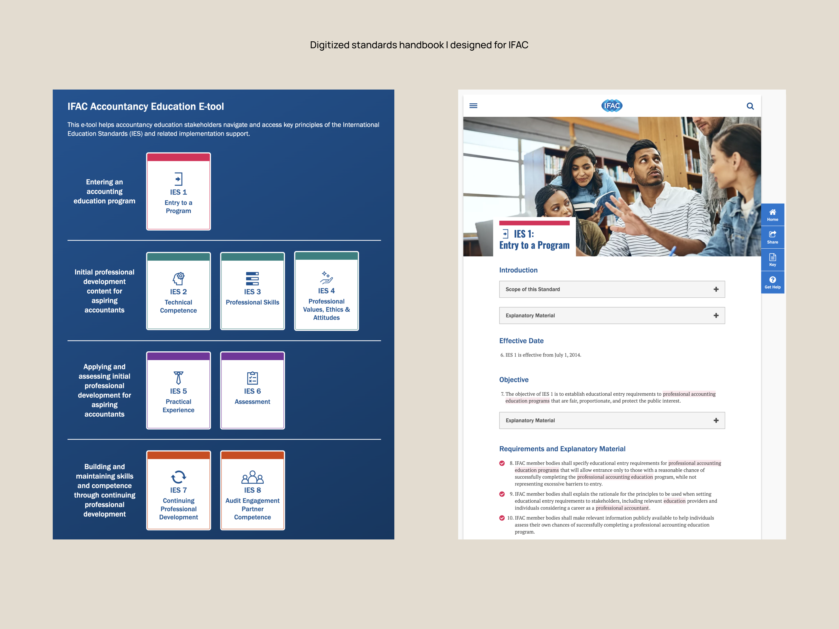
• 49.15% increase in standards handbook downloads (the most important document for each board)
• 2020 MarCom Gold award for Website Redesign
As a traditionally in-office profession, the move to working from home changed accountants' web behavior rather dramatically throughout 2020. Fortunately, the infrastructure we built for IFAC was up to the task.
It's hard to pin down what resulted from the redesign versus the shift to WFH, but for 2020 compared to 2019 across IFAC's properties, we saw a:
• 48% increase in users
• 55% increase in sessions
• 33% increase in pageviews
• 19% increase in session duration
All of this increased activity around best practices for implementing international standards helped support the flow of high-quality financial information to stakeholders, investors and the public during a particularly uncertain economic period.
The success of the resdesign inspired the client to keep us on to iterate and consult. I was tasked with spearheading the next phase of product strategy, which included:
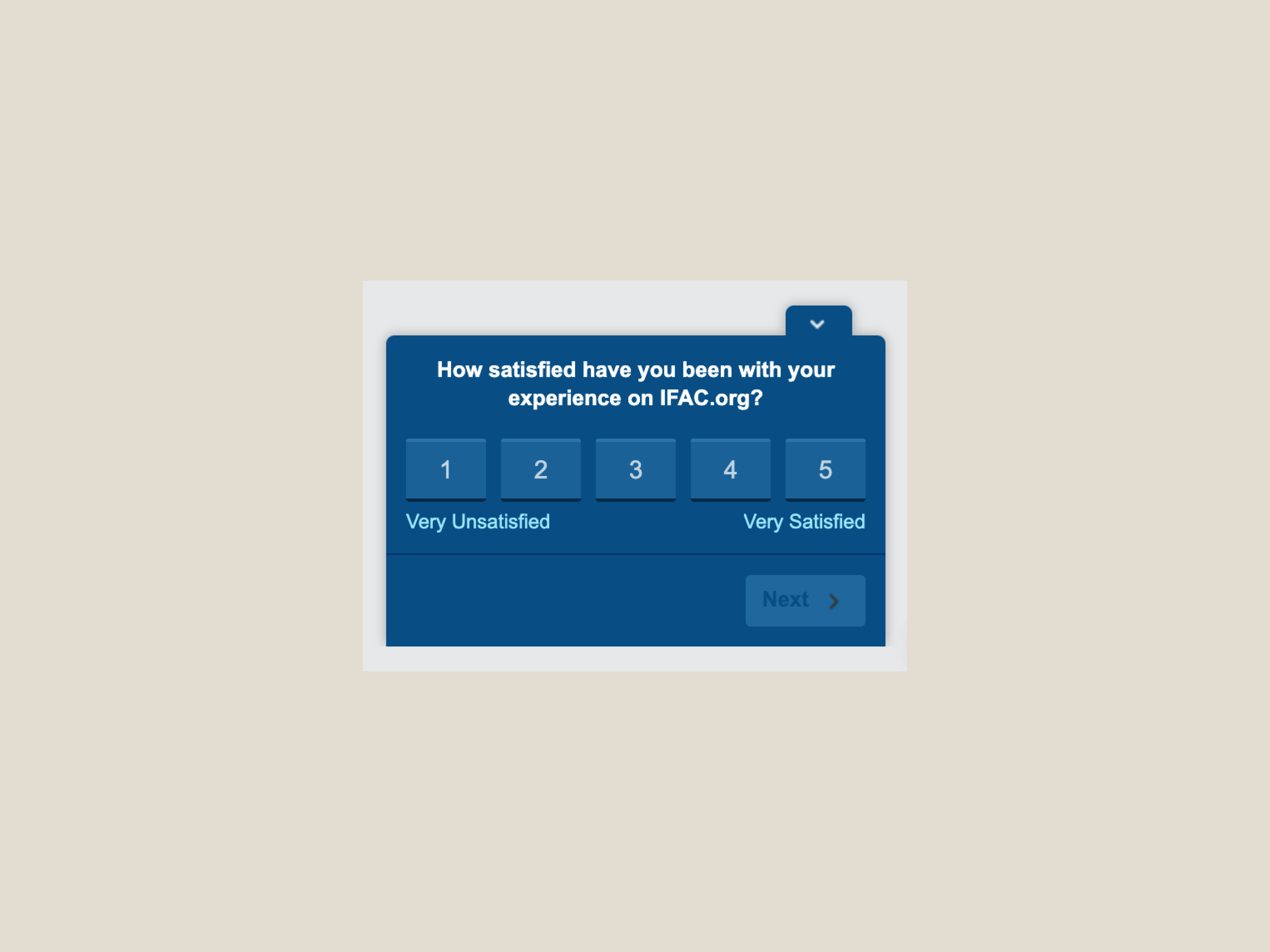
• Hotjar user surveys to refine our understanding of the typical users and their experiences with the site
• Using GTM and GA to evaluate time, depth, and comprehension of reading on technical articles
• Creating detailed personas representing high-value targets for the organization to help guide optimization
These informed further improvements until I left the agency in 2021.