AEOP
Remote — Maryland
Redesign
2017-2020
AEOP
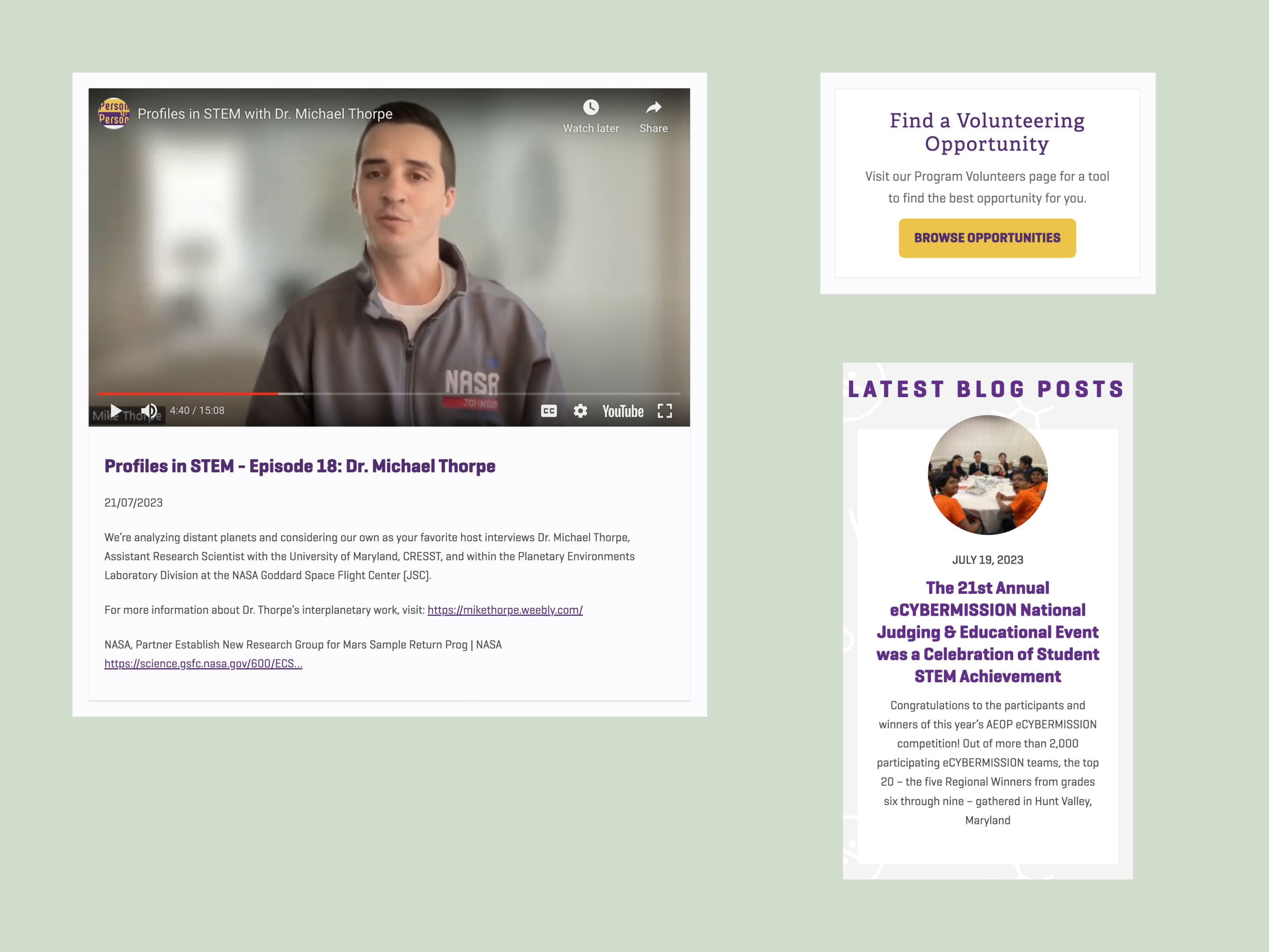
The Army Educational Outreach Program wanted to make it easier for students across the country to find the best free STEM programs for their individualized educational needs.
Agency Project

The Army Educational Outreach Program wanted to make it easier for students across the country to find the best free STEM programs for their individualized educational needs.
Science, Technology, Engineering and Mathematics (STEM) education has been a focal point in the U.S. for the last decade. Whether it's career readiness or building equal representation in classes at all grade levels, STEM is consistently top of mind for schools and parents across the country.
Classes and clubs are crucial starting points for STEM education. Putting what students learn there to work in an advanced laboratory setting is a unique opportunity that can transform their educational future. The Army facilitates that path by hosting a portfolio of advanced, free STEM programs for K-12 students, college students, graduate students, and teachers called the the Army Education Outreach Program. It gives them direct access to experience and mentorship with the military's world-class scientists, engineers, and research facilities during the school year and/or the summer.
When my agency team started working with AEOP, their old website was outdated and made it unclear what programs were even options for potential program participants. The programs were grouped together in an undifferentiated list, made more complicated by the fact that most are named with ambiguous acronyms. Our research indicated that this confusion was impeding applications and creating unnecessary friction for parents and students trying to find the right program for their needs.
AEOP brought us in for a full redesign of their website with two goals: 1.) to modernize the experience, including creating a broader array of content types that would improve its usefulness and discoverability, and 2.) to optimize it for students to understand which programs would be ideal for them, and if applications are open, to get them to apply.
As part of our agency team, I was the:
• Lead experience designer and architect, figuring out all aspects of site and page structures and user flows
• Content strategist and coordinator for content aggregation from the AEOP program leads
• UX writer for all elements and microinteractions
Because AEOP’s STEM programs are each run by government contractors, learning from their experiences (and later getting their buy-in) was crucial. I interviewed 11 directors and program managers at these organizations to better understand the needs of their students and where the site was failing them, as well as their own administrative goals and needs.
Since each contractor was concerned about a different subset of students it made for quite a bit to consider, although the diversity of perspectives was largely beneficial. A few priorities emerged, including:
• Allowing for geographic specificity so students don't get attached to programs that aren't available in their state, as well as enhanced eligibility criteria
• Paying specific attention to students who have already completed an AEOP program, since they're statistically more likely to complete another
• Accounting for volunteers as a key user group, since programs can't run without them
• Giving more space to individual locations of larger programs, since each lab has a very different research focus
• Making the experience more exciting and friendly - moving away from static content and incorporating more student stories and faces
In diving deep on AEOP's Google Analytics, I was struck by the concentration of traffic around individual program pages. Much of it was siloed, with users looking at one program briefly and leaving. Without any mechanism for directing users to similar programs, it occurred to me that giving students a tool to parse which programs to consider in the first place would be a huge help. I shared my findings with teammates from our agency's communications group and they validated this approach based on feedback they'd received as well.
Between interviews and analytics, a recurring theme was the importance of the delivering the tailored program information to students. Students and their parents wanted to know which programs would best suit their needs.
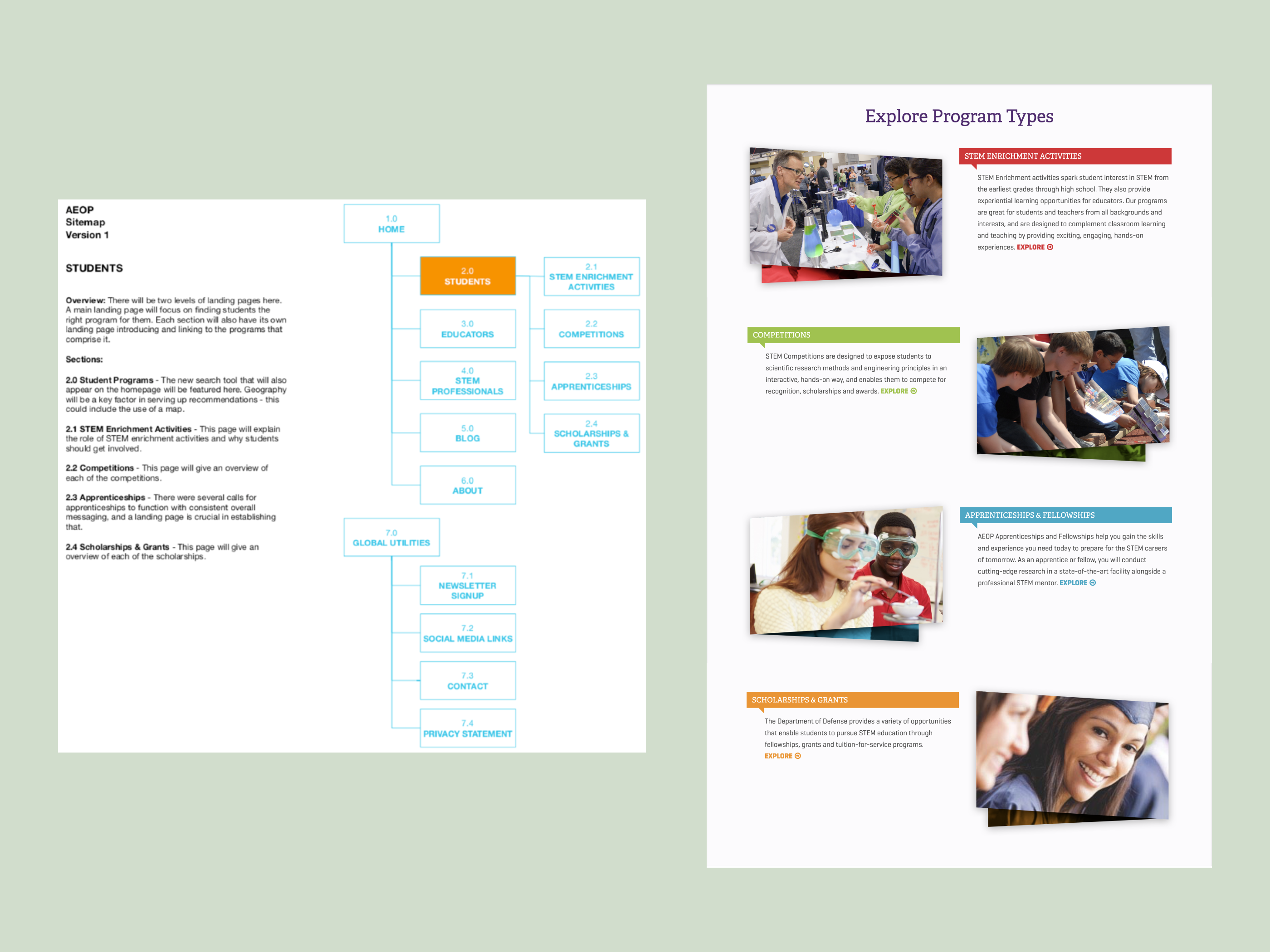
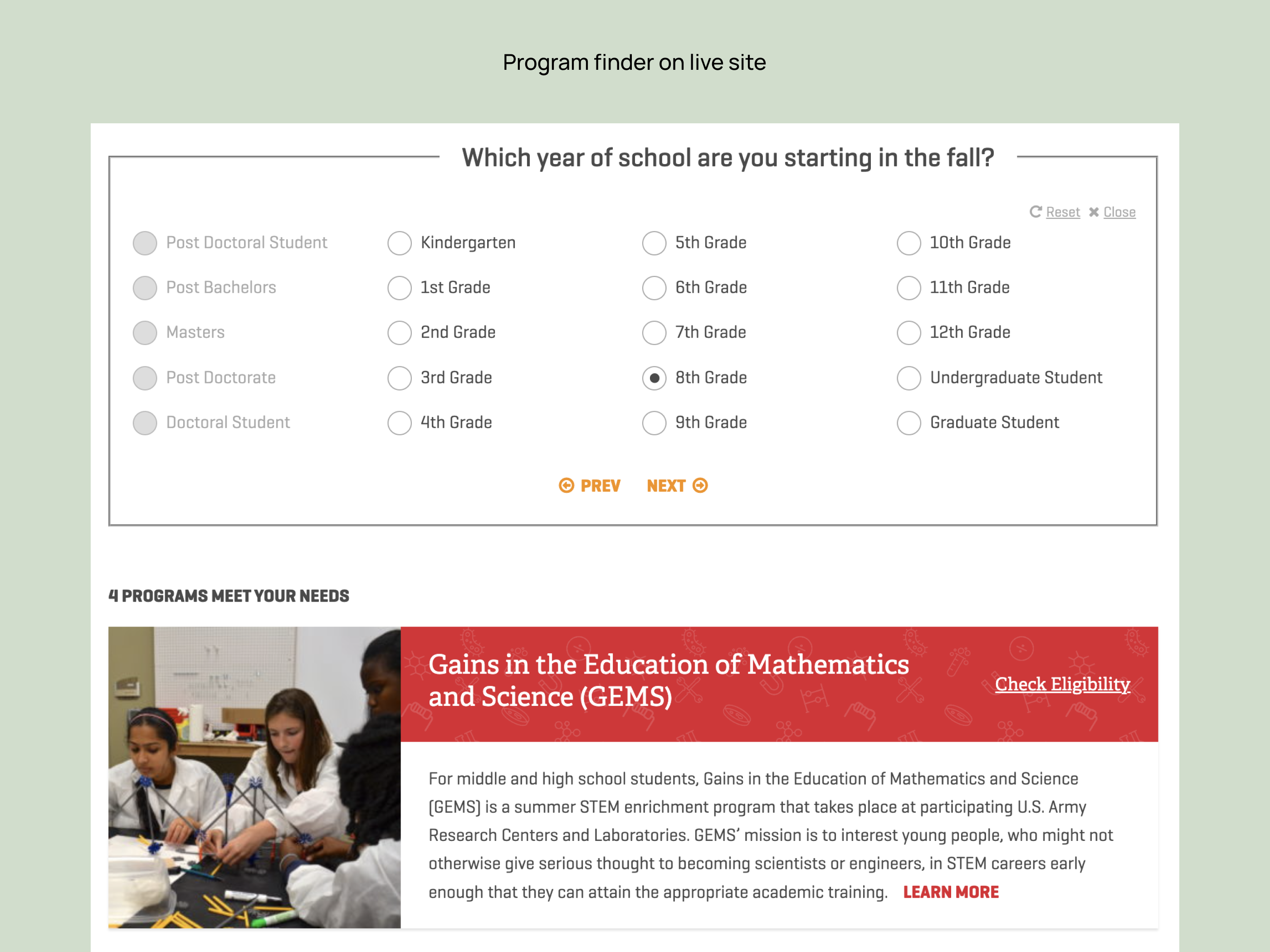
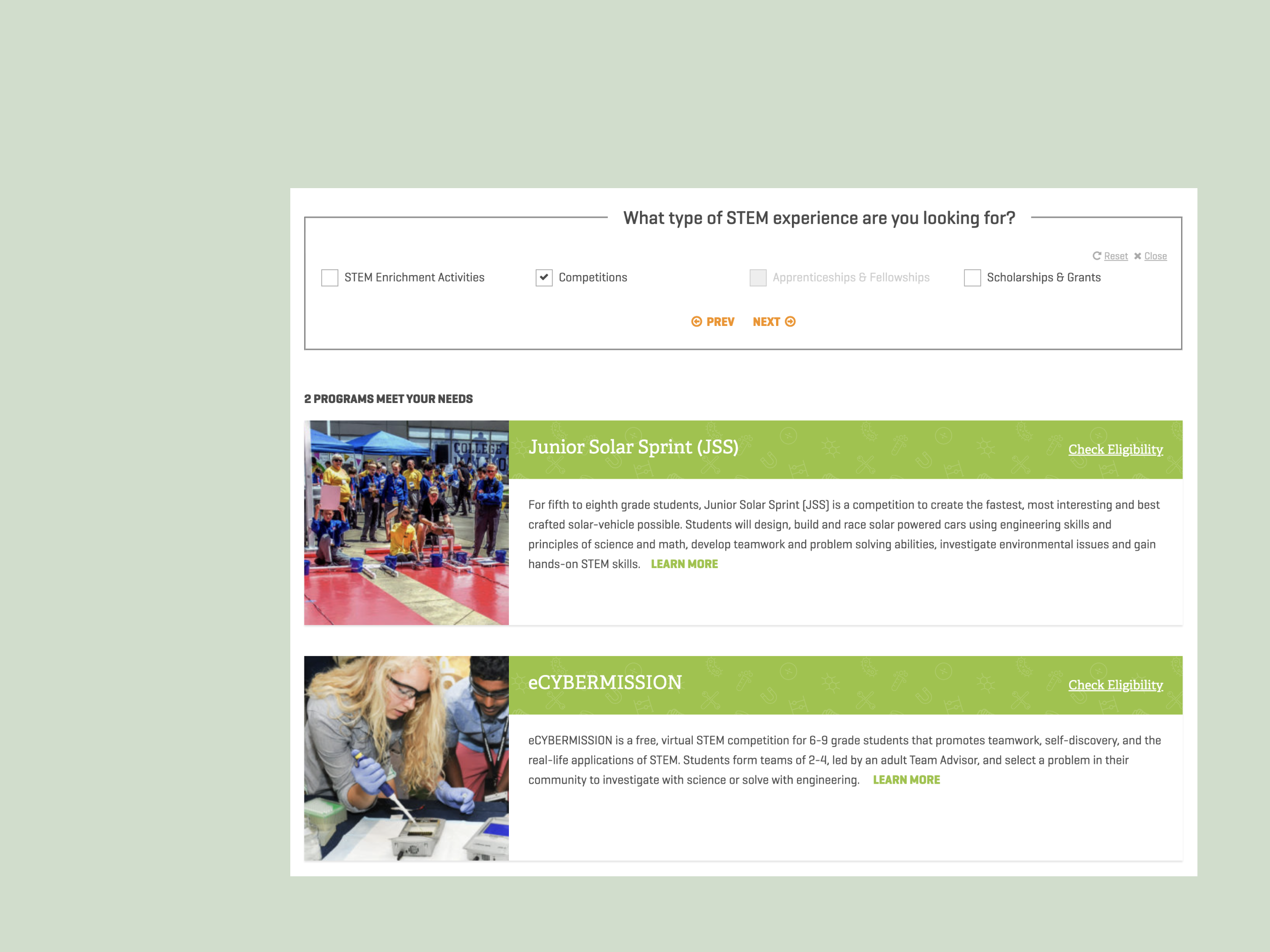
Based on this observation, I had the idea to build a purpose-built program finder to replace the generic map (first box in "It Starts Here") that AEOP previously had. While the map was labeled "program finder," it purely did that in the most literal sense - it told users where the programs were, and not which age group they were meant for, etc.
My thinking was that by asking users a few questions, we could pretty quickly guide them to which programs would be potentially interesting and available to them, avoiding the confusion and frustration of clicking through a generic map.
This, in conjunction with more robust content around the programs themselves, seemed like it would help students achieve better outcomes.
Since the groupings of AEOP’s programs were already set, the sitemap didn't change terribly from the previous iteration of the site. I carved out dedicated areas for alumni and dynamic blog content, and completed a content audit to establish which pages needed more robust writing.
In the end, most of my time went into the program finder. My architectural priority was to map out the user flow for students, educators and volunteers, making sure each step was meaningful and easy to understand.
I often vary the type of sitemap I create depending on the project. Here, because we were largely refining existing content, I included an overview of the types of content that would appear on each page. It helped make the sitemap less abstract for the client, and they were easily able to understand the page’s role and core message.
I also created a user flow to make sure all modalities were accounted for.
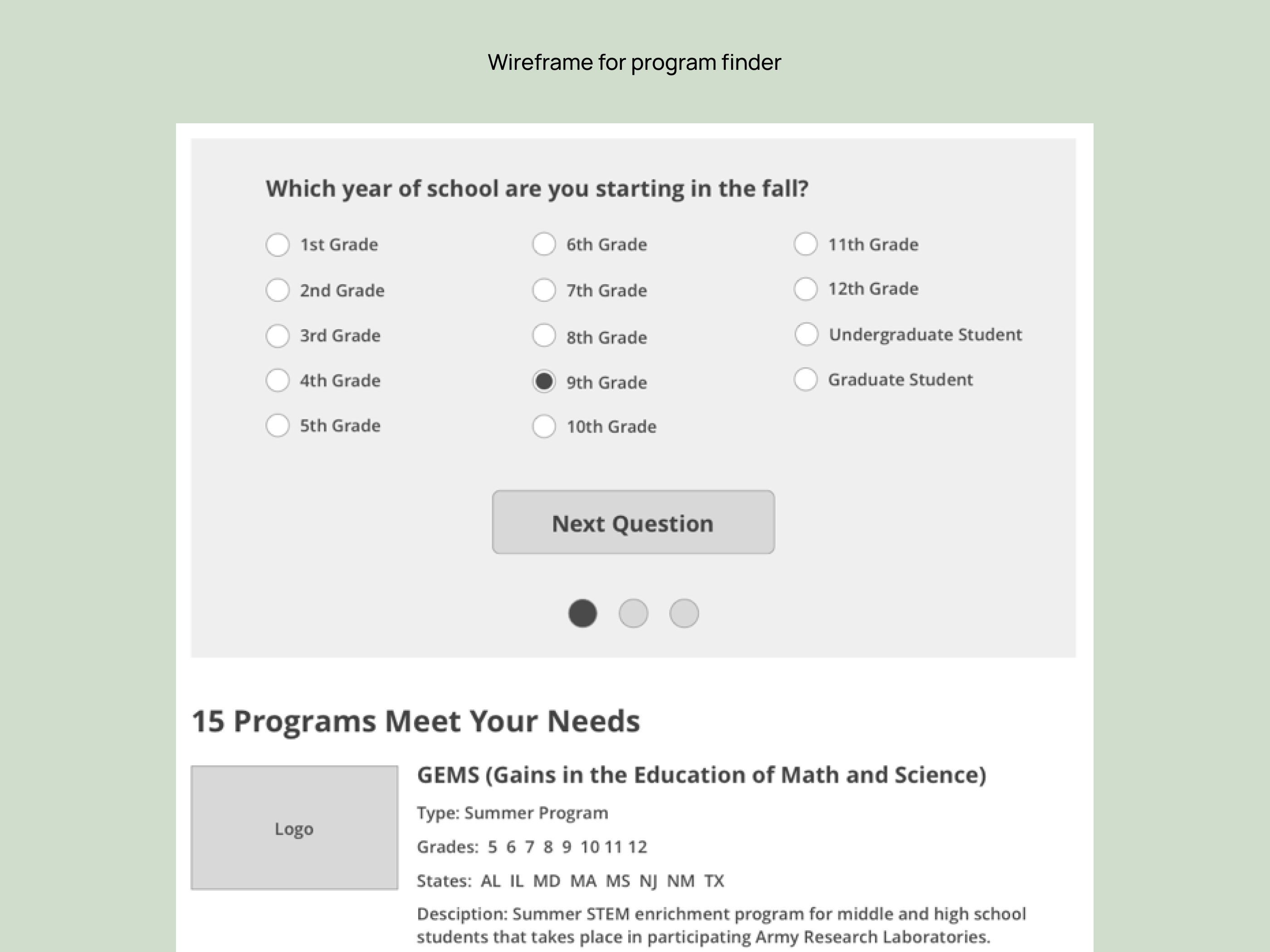
While I ended up wireframing 11 page templates, most of my attention went into fleshing out all the possible configurations for the program finder.
I wireframed and prototyped 24 different potential steps, including permutations for underserved students and for volunteers with varying levels of expertise.
Of course, we still ended up tweaking the structure and logic a bit once it was live, but reaching this level of detail in the wireframe phase made for a relatively smooth launch for the product.
I had help from my project manager on assembling the site in the CMS, so instead used my time to shepherd the content creation process for the contractors, and then write copy for specific UI elements and UX pieces to make everything flow together.


• In 2019, the first full year with the finder, it was used 88,506 times. Given that we had 143,613 users over that period, the level of adoption was much faster than we anticipated
• This success led to the finder being the focus of a paid campaign in 2020. With that influx of paid traffic, balanced out a bit by program cancellations from COVID, it was used over 150,000 times in two years
• 9 of 12 programs saw an increase in applications from the period preceeding the redesign versus the period after
Since the platform used for program registration data doesn't offer reporting, one tricky element was that we lacked registration data going into the project to benchmark against. Fortunately, after launch we were able to implement GTM to track clicks on conversion points like “Apply” or “Get in Touch” to inform iterative design changes.
The finder has been particularly impactful in increasing the number of students getting world-class, hands-on STEM experience, increasing their preparedness for both school and the workplace.
